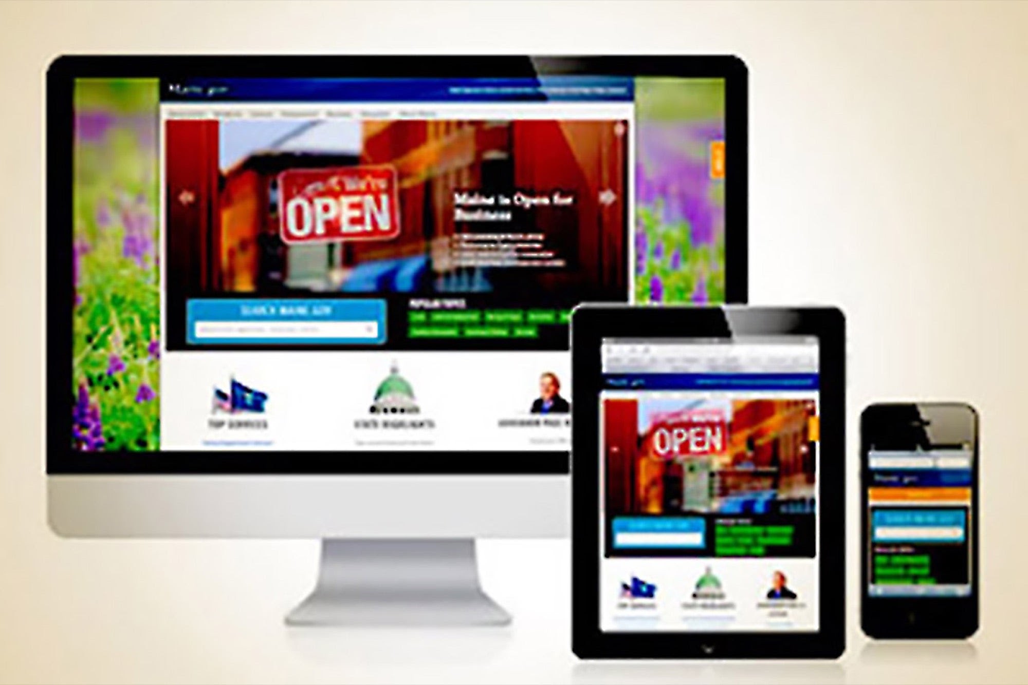
In this digitally active world, everything should be easily accessible to people otherwise, their effectiveness is not highly rated. Imagine a website that you can view properly on your desktop but distorts when you try to access it on a mobile phone or a tablet. It annoys people to have non-responsive websites, forget about a non-responsive learning management system (LMS). A responsive design ensures that learners can easily access the content at its best. To make an LMS mobile-friendly, responsive design plays a key role. So, let’s get to know the importance of LMS responsive design and the benefits.

What does a Responsive Design do?
A responsive design allows seamless access to learning content on an LMS across devices, such as mobile phones, tablets, iPads, desktops, laptops, etc. The LMS interface effortlessly aligns with the device’s screen size automatically. With a responsive design, an LMS can be easily deployed, progress can be tracked, and content can be accessible to a larger audience.
How does a Responsive Design Work?
Responsive design frameworks for online learning platforms with the course playing and content authoring tools, course developers can use HTML5 to create multi-device accessible content. When the same content is accessed on different platforms the way of presenting the content changes and not the content. Tagging features can be used with CSS3 to ensure that mobile users are able to see the content properly without being overwhelmed. It ensures that there are no onscreen distractions for the learners.
What is the Importance of Responsive Design for an LMS?
For continuing education of employees and external stakeholders of an organization, responsive design is crucial. Without that retaining learners with a device-independent platform would be tough. All the learners might not have a computer to learn and their mobile devices and tablets can work as the primary learning devices. Moreover, these mobile devices enable offline learning even without network connectivity, which is great for people who are always on the go. Learners’ freedom is the top priority of responsive design learning platforms as they ensure anytime and anywhere learning, right on the devices they possess. A responsive design embraces technology faster. Learning content aligns properly with each software release.

Advantages of Responsive Design for an LMS:
- A responsive design for an LMS allows any time, anywhere, and on any device learning.
- Better reachability makes the LMS content have a broader audience outreach.
- No chance of quality or content loss while consuming content on devices with smaller screen sizes.
- Small course modules consumable on mobile devices save time, training cost, and resources.
- Swiping and zooming in and out functions make LMS content user-friendly. Responsive design allows both these features for an LMS
- A responsive design adapts to the latest devices flawlessly and saves developer-time and money
- An HTML5-compliant content authoring tool efficiently accommodates responsive design-relevant content for learners.
Let’s explore some more about responsive designs.
MapleLMS Responsive Design Features:
MapleLMS has a responsive design with a galore of features to keep learners engaged, motivated, and continue their learning no matter where they are. Here are the best features of this responsive design LMS that enhance learning experiences across industries.
- Reporting and Analytics
MapleLMS enables seamless content integration across devices and platforms. Support to SCORM/xAPI/AICC content standards enables the LMS content to be easily trackable and reportable. AI technology also strengthens the reporting mechanism. The reporting feeds analytics that brings meaningful insights for future learning experiences. This improves the learning experience and makes the content accessible across platforms and devices.
- Interactive Interface
A neat user interface is the key to a better user experience. MapleLMS has an interactive platform that even non-tech-savvy people can use easily. There is no need to be technically proficient to manage MapleLMS as everything is smooth and easy within a responsive design.
- Offline (network-independent) and Online Learning
Unlike other popular LMSs, MapleLMS has an amazing mobile app that is accessible both online and offline. Why let the network decide your learning time? You can always learn on the go with MapleLMS mobile app, without any hassle. The gamified platform with a responsive design and engaging rewarding system promotes continuing learning. The learners learn and earn badges, certificates, leaderboards, etc., within the gamified platform.
- E-commerce for Revenue Generation
You can utilize the built-in e-commerce platform available with MapleLMS, to sell course content, training, registration, event bookings, membership, and merchandise. Support for a wide range of payment gateways makes the online purchase experience a cakewalk. Associations can generate non-dues revenues using the eCommerce platform for some additional income.
The goodness of MapleLMS responsive design can’t be covered in a single article. MapleLMS has plenty of other features too. MapleLMS offers AI-enabled learning path suggestions, and course suggestions depending on the roles, learning history, and experiences of learners. It also has AI-proctoring for pre-hiring and employee assessment, and certification exams; automated admin processes and certificate generation; white-labeled LMS and branded mobile apps; course libraries; SCORM/AICC/xAPI compliant content authoring tools; multiple languages and content formats support; and a lot more. Explore MapleLMS for more!
Demo
Tags

